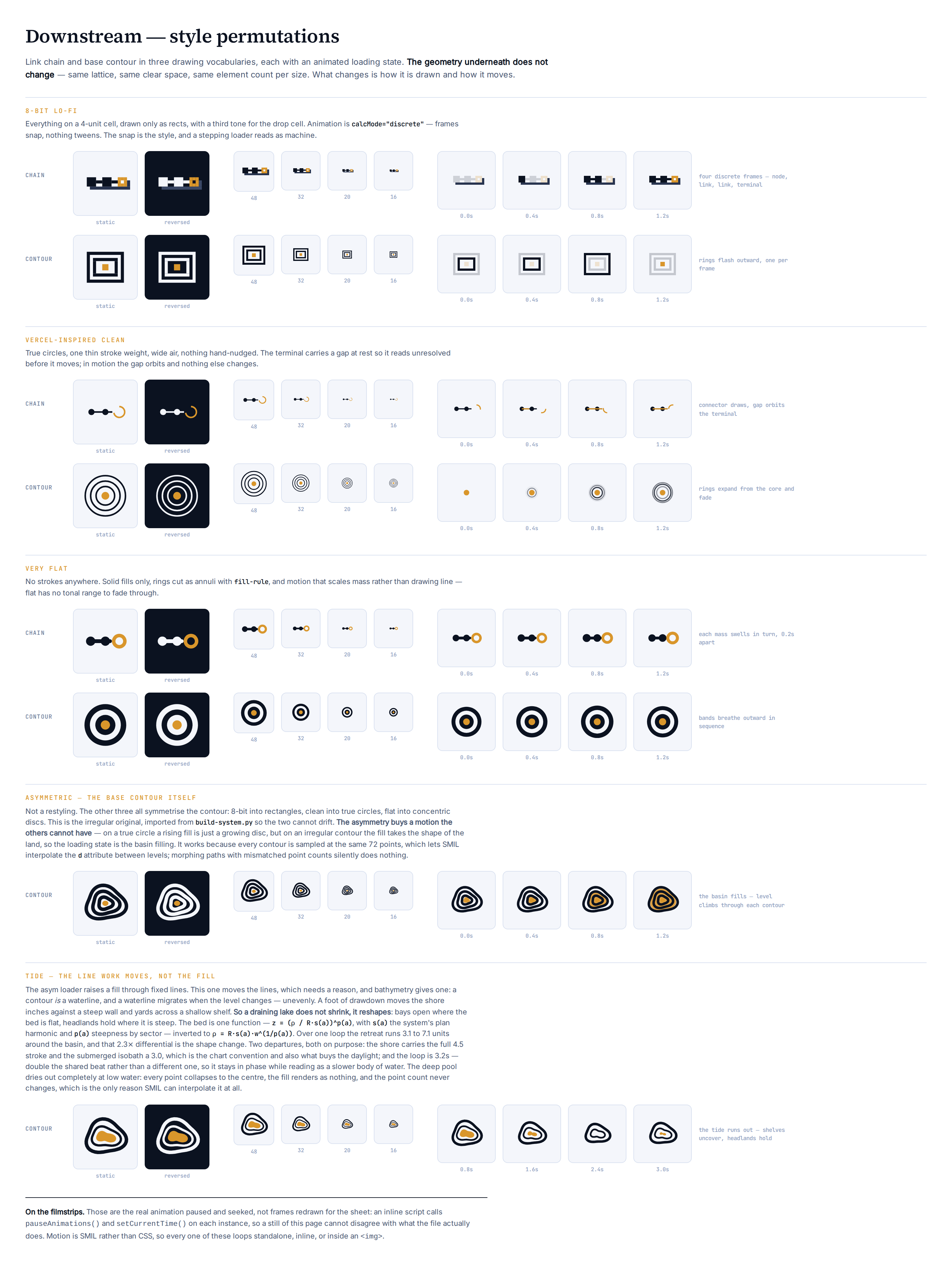
Link chain and base contour in three drawing vocabularies, plus two takes on the asymmetric base contour itself — eight marks, each with an animated loading state.
The geometry underneath does not change. Same lattice, same clear space, same element count per size tier. What changes is how it is drawn and how it moves — which is the point of running permutations rather than redesigns.
The three takes
8-bit lo-fi. Everything snapped to a 4-unit cell and drawn only as rects, with a third tone for the drop cell. Animation is calcMode="discrete" — frames snap, nothing tweens. The snap is the style, and a stepping loader reads as machine rather than as motion design.
Vercel-inspired clean. True circles, one thin stroke weight, wide air, nothing hand-nudged. The contour's clean reading is not a wobble drawn precisely — it is the wobble removed, leaving concentric circles. The chain's terminal carries a gap at rest so it reads unresolved before it moves; in motion the gap orbits and nothing else changes.
Very flat. No strokes anywhere. Solid fills only, rings cut as annuli with fill-rule, and motion that scales mass rather than drawing line — flat has no tonal range to fade through, so opacity is not available as a device.
The fourth contour
The three takes above all symmetrise the contour — 8-bit into rectangles, clean into true circles, flat into concentric discs. Added to the set: the irregular original, imported from build-system.py rather than re-typed so the two cannot drift apart.
The asymmetry buys a motion the others cannot have. On a true circle a rising fill is just a growing disc. On an irregular contour the fill takes the shape of the land — so the loading state can be the basin filling, the level climbing from the core out through each contour line in turn. That is the concept moving, not a spinner borrowed and recoloured.
It works because every contour is sampled at the same 72 points, which lets SMIL interpolate the d attribute directly between levels. Morphing between paths with mismatched point counts silently does nothing — no error, no motion.
Tide — moving the line work instead of the fill
The basin-filling loader raises a fill through lines that stay put. This one moves the lines, which needs a reason for them to move, and bathymetry supplies one: **a contour is a waterline**, and a waterline migrates when the level changes.
It does not migrate evenly, and that is the whole idea. A foot of drawdown moves the shore a few inches against a steep wall and yards across a shallow shelf. So a draining lake does not shrink, it reshapes — bays open where the bed is flat, headlands hold where it is steep. Uniform scaling is what a lake never does.
The bed is one function, in polar form:
z(rho, a) = (rho / (R * s(a))) ** p(a)
s(a) is the plan harmonic, the same third-harmonic wobble the system contour uses. p(a) is bed steepness by sector: large p is a wall — the term goes to 1 and the waterline barely moves — and small p is a shelf, where it collapses and the waterline runs. Inverting for the waterline at level w gives the only line of geometry in the mark:
rho(a) = R s(a) w ** (1 / p(a))
Over one loop the shore retreats between 3.1 and 7.1 units depending on sector. That 2.3× differential is the shape change; without it this would be a scale animation wearing a nautical hat.
Two departures from the other six, both deliberate:
•Weight is split. The shore carries the full 4.5 stroke and the submerged isobath a 3.0. That is the chart convention — the shoreline is the heavy line — and it is also what buys the daylight, since three levels inside a 25-unit radius at one uniform weight cannot clear each other in the steep sectors.
•The loop is 3.2s, double the shared beat rather than a different one, so it stays in phase with the rest of the set while reading as a slower body of water. A tide at spinner speed is a washing machine.
The deep pool dries out completely at low water — for a quarter of the loop there is no ochre in the mark at all. That is the real behaviour of a shallow basin, and it costs nothing: w goes negative, every point collapses to the centre, and the fill renders as nothing while the point count never changes. Which is the only reason SMIL can interpolate it at all.
The constraints are asserted over every frame, not eyeballed on one — a tide that closes the daylight between two waterlines somewhere mid-loop fails the build. One of those assertions checks the mark against the system: at full level the exponent term is 1 in every sector, so the shore reduces exactly to build-system.py's contour. If the shared harmonic ever drifts, that fires rather than passing quietly.
Loading states
motion
chain · 8bit
four discrete frames — node, link, link, terminal
chain · clean
connector draws left to right, gap orbits the terminal
chain · flat
each mass swells in turn, 0.2s apart
contour · 8bit
rings flash outward, one per frame
contour · clean
rings expand from the core and fade
contour · flat
bands breathe outward in sequence
contour · asym
the basin fills — level climbs through each contour
contour · tide
the tide runs out — shelves uncover, headlands hold
Seven share a 1.6s loop so they read as one system rather than a pile of unrelated animations; tide runs at 3.2s, which is that beat halved rather than abandoned.
Motion is SMIL, not CSS, so each file loops standalone, inline, or inside an <img> — a loading indicator that only works when the host page cooperates is not much of a loading indicator.
Three things the build caught
Worth recording, because each was invisible in the source and obvious in the render:
1.The 8-bit chain merged into one bar. Two-cell nodes against a one-cell connector sharing a top edge have no silhouette step. Nodes are three cells now, connector one, centred.
2.The 8-bit contour read as vertical stripes. The rings cleared each other in x but stacked in y, so the top and bottom runs fused into a solid band. They now clear by a full empty cell on both axes.
3.The flat chain's scale animation walked. An additive scale on a positioned shape translates it. Each shape is drawn at the origin now, with the group carrying the position, so it pivots on its own centre.
In the mark row
All eight are published to the root alongside every other concept, rendered from their one-colour cuts so the row stays a silhouette comparison rather than a gallery.
Three would not survive a recolour and were redrawn for it:
•flat contour is stacked discs — its bands exist only as the boundary between two fills, so a single colour collapses it to a plain disc. The mono cut is an annulus plus a core: two elements instead of four, the same reduction logic the size tiers use.
•tide's pool is a filled shape reading against two stroked waterlines. In one colour a fill that size is a blot, not water, so the mono cut draws the pool as the third waterline at the isobath's weight.
•the 8-bit drop cell is a two-tone device. Matched to the mark it sits behind, it stops reading as depth and just thickens the silhouette, so the mono cut drops it rather than flattening it.
Nothing here is selected. These are permutations of two surviving families, not a fourth and fifth concept.
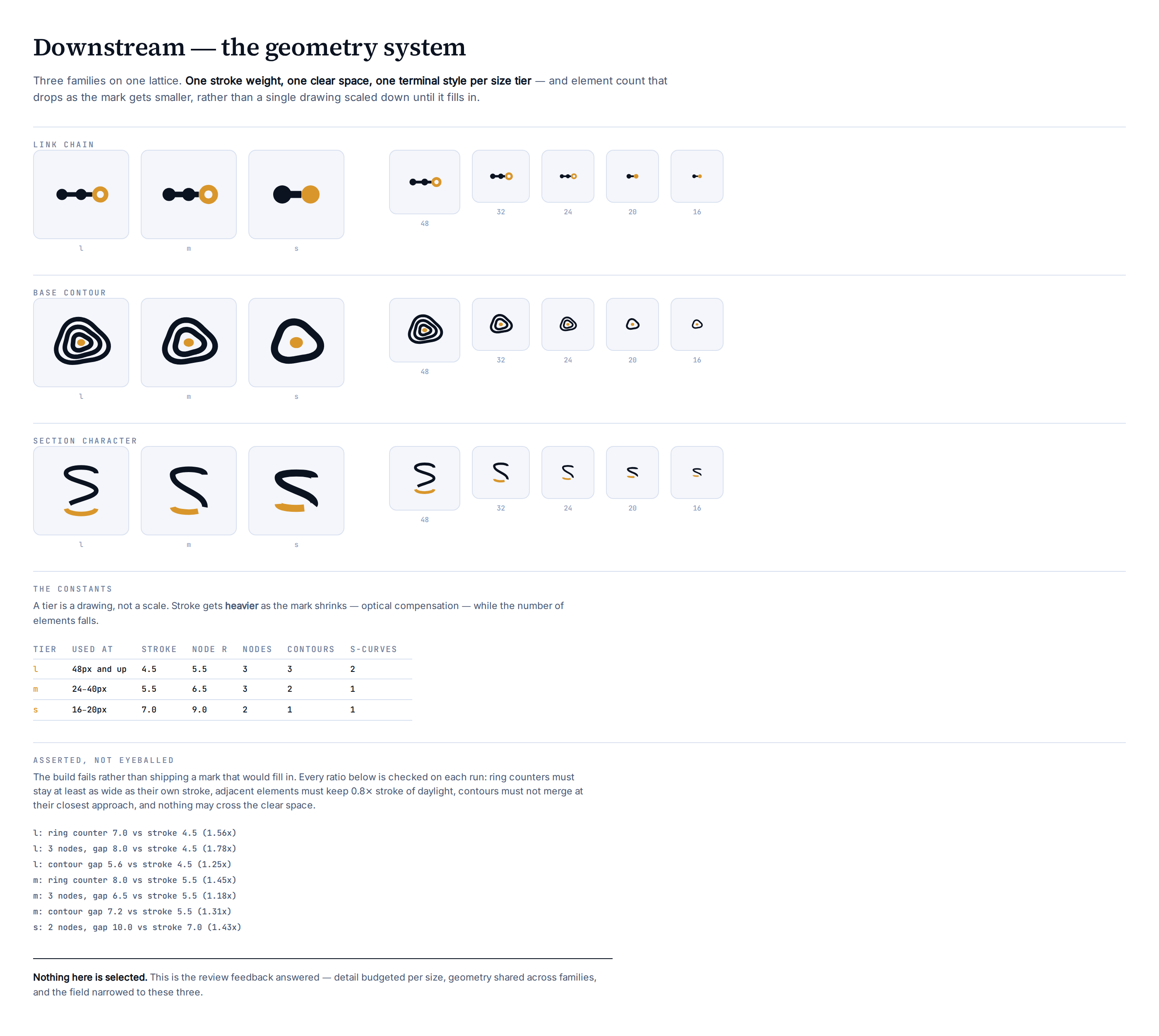
The geometry system
Review:"some logos have too much detail to work at 16 or 32" and "need consistent geometry." Those turned out to be one problem, so this is one fix.
What was wrong
Every mark in the old set was one drawing, scaled. A 64-unit design rendered at 16px keeps all its detail and loses all its daylight — counters close, strokes merge, and what was a chain becomes a grey bar. The contour was the worst case: five irregular rings built from 3rd, 5th and 7th harmonics, none of which survived below 32px.
The families were also built by three different methods. The section mark was a filter-rounded glyph clip. The chain was filled circles. The contour was sampled polylines. Put side by side, nothing about them agreed — not stroke weight, not terminal style, not clear space.
What changed
A tier is a drawing, not a scale. Three tiers, each drawn for the pixel budget it actually gets:
tier
used at
stroke
elements
l
48px and up
4.5
full
m
24–40px
5.5
reduced
s
16–20px
7.0
minimum
Stroke gets heavier as the mark shrinks. That is optical compensation, not a mistake: a hairline that reads at 96px disappears at 16px, and the eye reads weight before it reads shape.
All three families are now stroked paths at the shared weight. That single change is most of the consistency: they sit on one 64-unit lattice, share a 4-unit clear space, and use butt terminals throughout.
The part worth trusting
Every constraint is asserted at build time, not eyeballed:
•ring counters stay at least as wide as their own stroke
•adjacent elements keep 0.8x stroke of daylight
•contours may not merge at their closest approach
•nothing crosses the clear space
The build fails rather than shipping mud. It already caught one: the chain's three nodes at 16px sat 3 units apart against a 7-unit stroke, so the small tier dropped to two. That reduction is in the set because an assertion found it, not because anyone noticed it later.
Nothing here is selected. This is the feedback answered — detail budgeted per size, geometry shared across families, and the field narrowed to three.
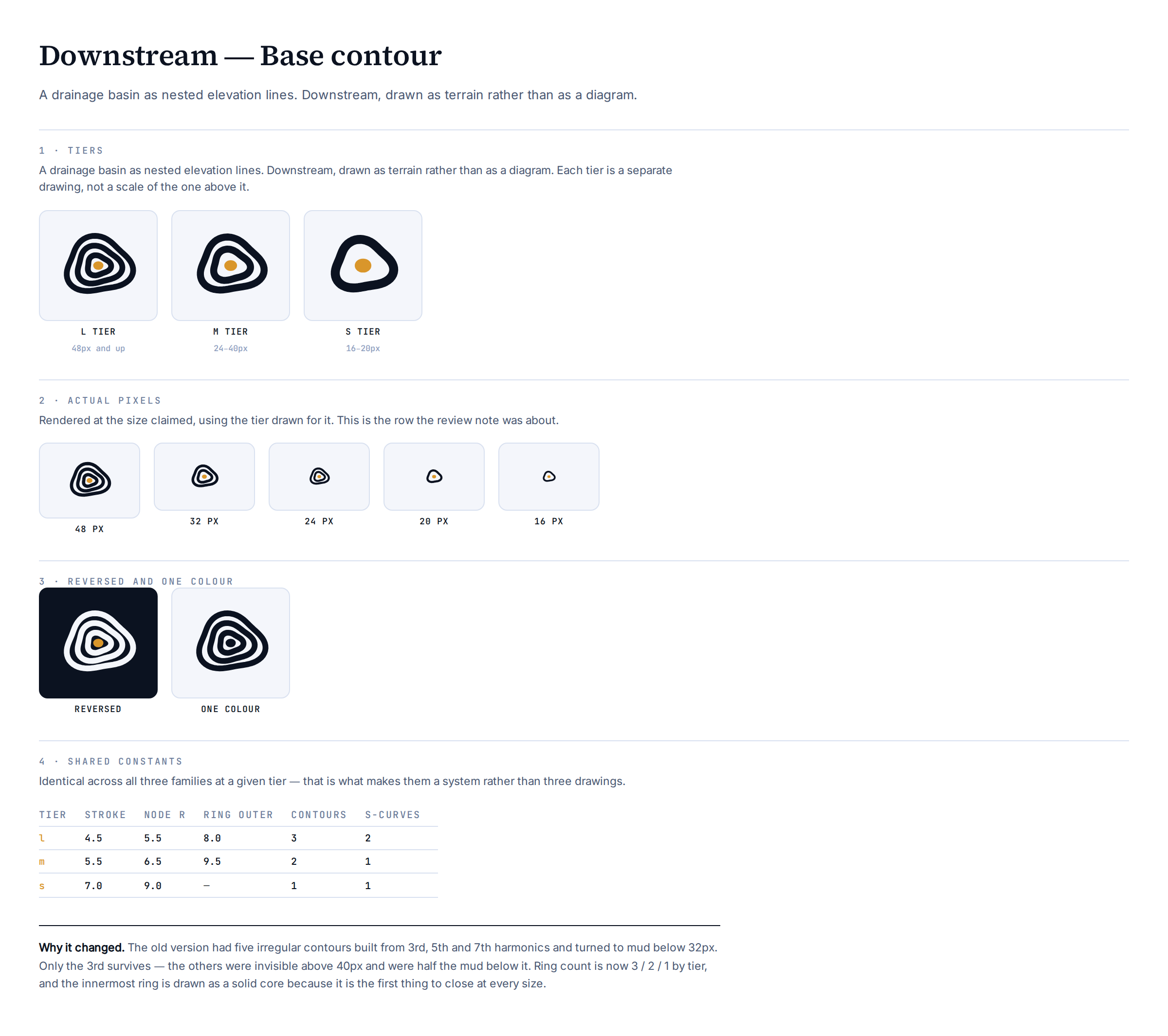
Base contour
A drainage basin as nested elevation lines. Downstream, drawn as terrain rather than as a diagram — the only mark in the set that says the name without saying the mechanism.
What was wrong
This was the mark the review note was really about. The old version had five irregular contours built from three harmonics stacked together:
r = base * (1 + 0.13·sin(3θ) + 0.07·sin(5θ) + 0.04·sin(7θ))
The 5th and 7th harmonics were invisible above 40px and were half the mud below it — detail that cost legibility everywhere and paid off nowhere. It was already documented as dying below 32px and reclassified as a pattern.
What changed
Only the 3rd harmonic survives. One low-frequency wobble is enough to read as terrain rather than as concentric circles; everything above it was noise.
Ring count is now a function of tier — 3 at large, 2 at medium, 1 at small — with the minimum radial gap asserted at 1.2x stroke, measured at the closest approach of adjacent rings rather than at their nominal radii.
The innermost ring is a solid core. At every tier it was the first thing to close, so it is now drawn closed on purpose. That also gives the mark its single ochre accent without adding an element.
Where it stands
The most distinctive silhouette of the three, and the only one that is not a diagram. It survives to 16px now, which it did not before — but it is also the least specific about what the company does, and at small sizes it reads as a generic blob more than the other two.
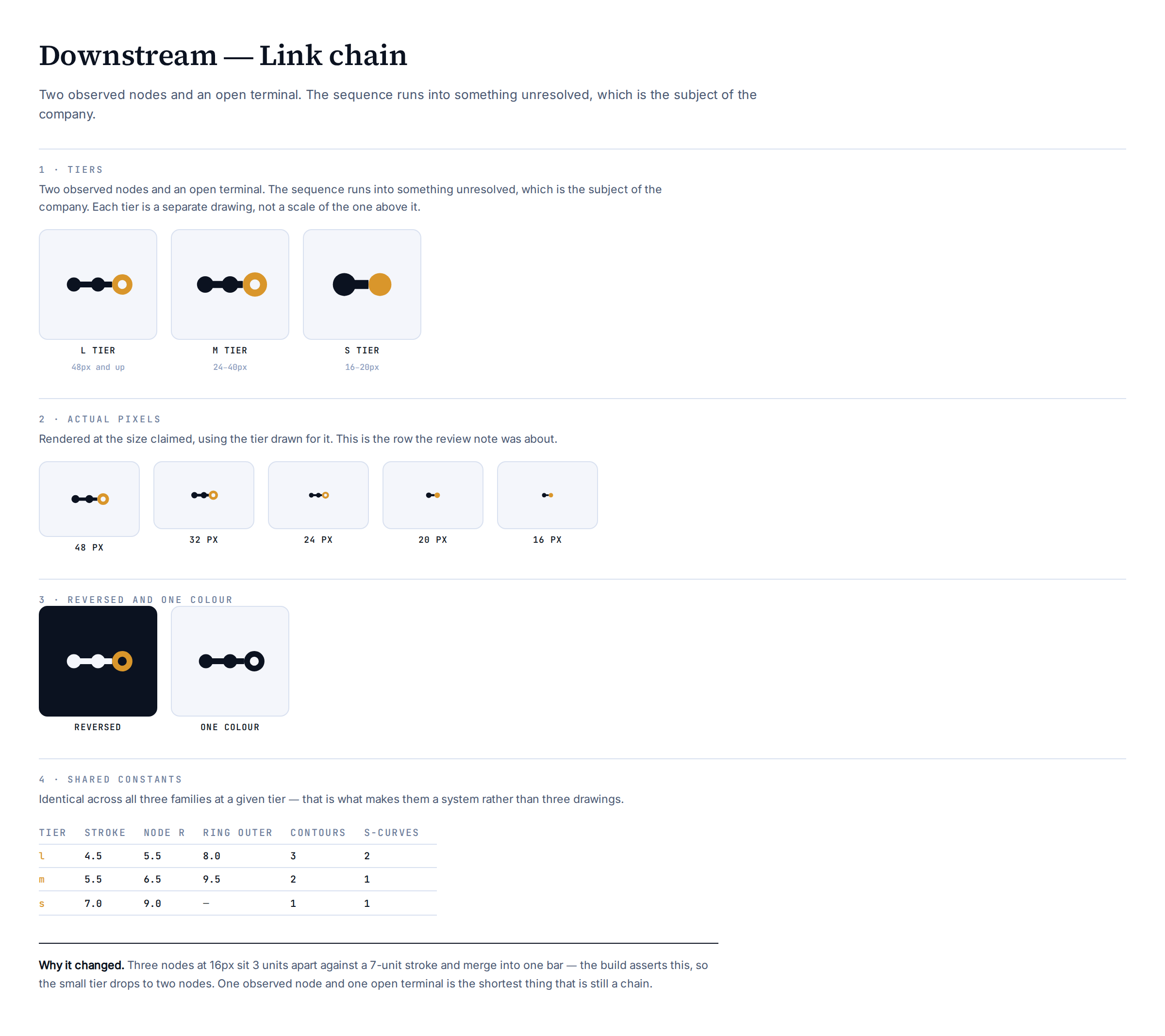
Link chain
Two observed nodes and an open terminal. The sequence runs into something unresolved, which is the actual subject of the company.
What changed
The mark was already close — it arrived as a supplied render and was redrawn from it. The work here was fitting it to the system: node radius, stroke and spacing now come from the shared tier constants rather than from measurements taken off a PNG.
One real geometry fix: the connector now stops at the terminal's outer edge. It used to run to the ring's centre, and a bar crossing an open ring closes it visually even when the geometry says otherwise. At 32px that was the difference between an open terminal and a smudge.
The 16px reduction
Three nodes do not fit at 16px. At the small tier they sit 3.0 units apart against a 7.0 unit stroke — they merge into one bar. The build asserts this and fails, which is how it was found.
So the small tier is two nodes: one observed, one open. That is the shortest thing that is still a chain, and it is the review note answered rather than argued with.
The terminal also stops being a ring at that size — no ring holds a counter at 16px at any legible weight. It stays distinct by colour and by being the only element the connector does not touch.
Where it stands
Strongest of the three on legibility; it survives every size intact. Weakest on distinctiveness — nodes-on-a-line is a common shape, and the argument for it rests on the open terminal rather than on the silhouette.
Section character
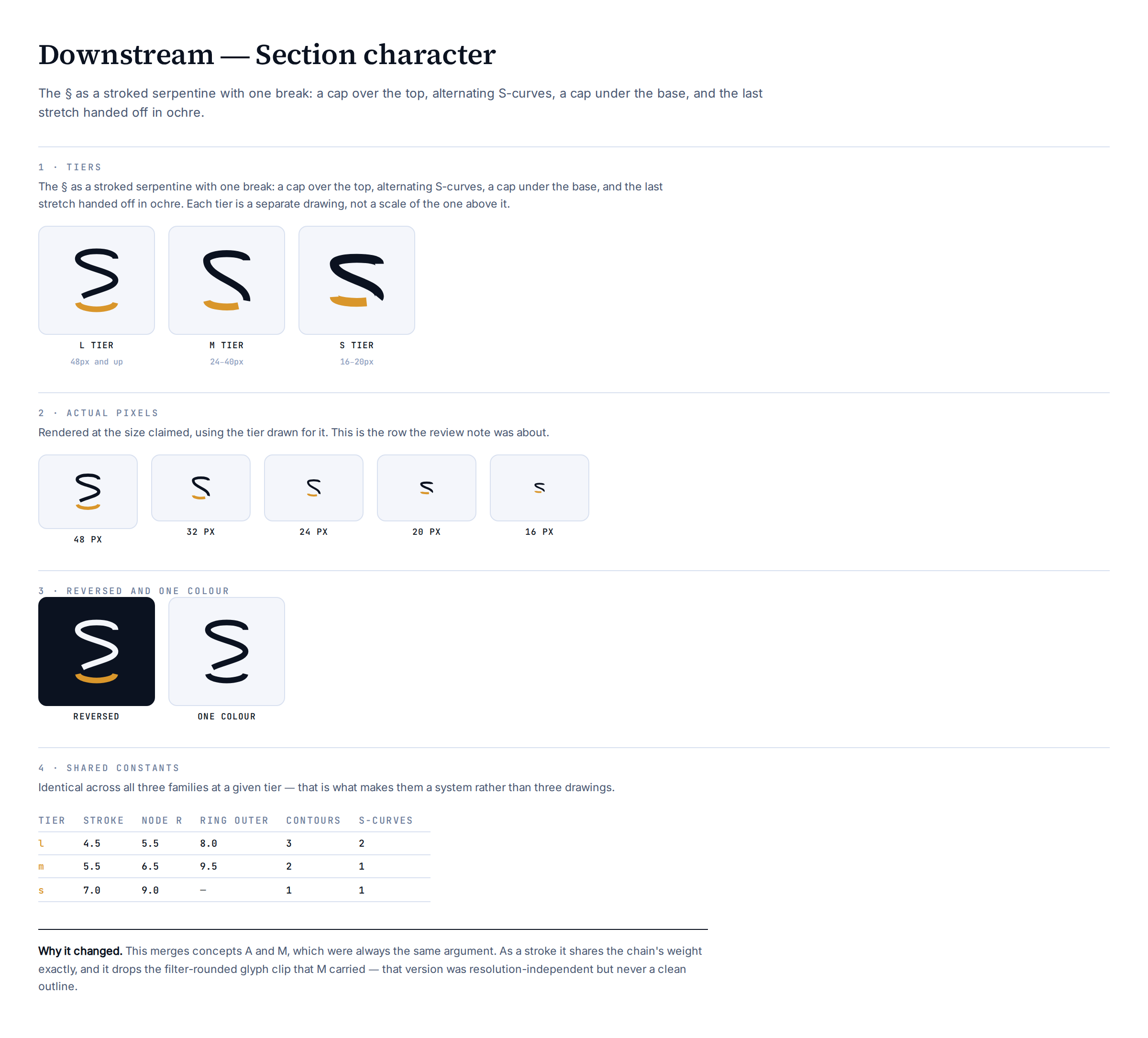
The § as a stroked serpentine with one break: a cap over the top, alternating S-curves, a cap under the base, and the last stretch handed off in ochre.
What changed
This merges concepts A (the § redrawn as a river meander) and M (the real § tipped and broken). They were flagged in brand/README.md as "the same argument twice", and keeping both was costing a slot in a set that needed narrowing.
The bigger fix is construction. M was built by clipping a glyph outline and rounding it with a blur-and-threshold filter — resolution-independent, but never a clean outline, and it could not share a stroke weight with anything because it had no stroke. Drawn as a path, the section mark now uses the chain's weight exactly.
The first attempt at the serpentine improvised its control points and produced a scribble. This is concept A's construction generalised: cap, k alternating S-curves, cap — where k drops from 2 to 1 as the tier shrinks.
The break
Kept from the off-centre work rather than rediscovered. The break sits at 74% of the path, not at the middle, because a centred cut spends its width on the crossing where the two lobes interlock — the one feature that makes the shape read as §.
Break width scales with the stroke at 1.5x, so it opens as the mark shrinks instead of closing.
Where it stands
Carries the citation argument no other mark here can: § is what every statutory reference already uses. That is the strongest reason in the set.
The open question is unchanged and still not settled by looking at it: a § bent and broken far enough to read as a chain may no longer read as a §, in which case the argument that justifies it is gone even though the form survives. Test that on someone who reads citations daily, not on a designer.
Provenance — the mark as a system
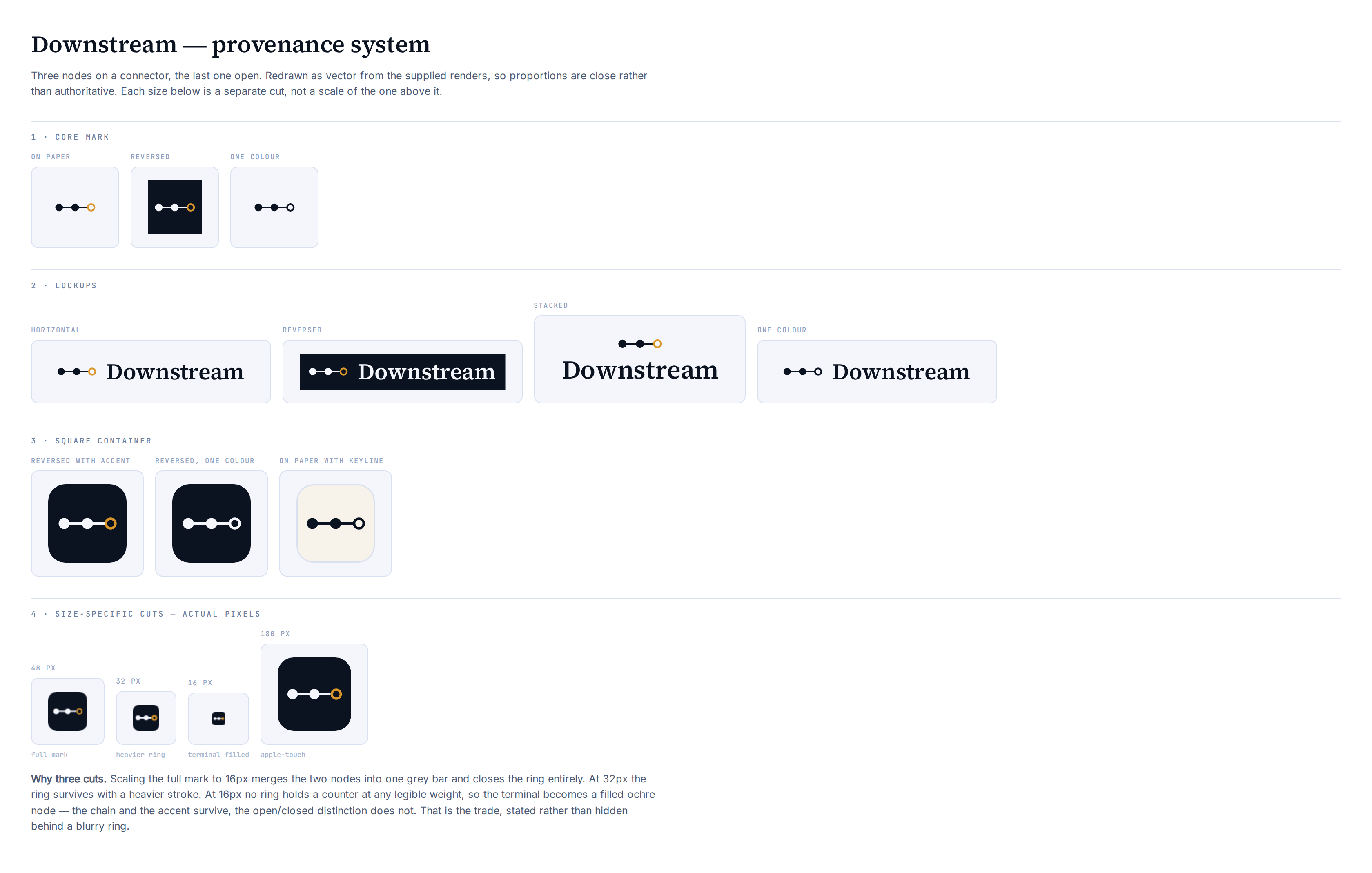
The supplied mark, worked up into a full identity system: core mark, four lockups, three square-container treatments, and the size-specific icon cuts.
What was done
The mark arrived as two rendered images, not source files, so everything here is a redraw measured off the render — proportions read from the 1244px icon and normalised to a 64 grid. Close, but not authoritative. If the original vector exists it should replace this.
Three deviations from what was supplied, all deliberate:
•The orange was normalised to brand ochre #D9962B. The supplied icon reads warmer, nearer #E8940F. Matching it exactly would put the most visible asset off the palette in design.md §3 on day one.
•Lyon Display is substituted with Source Serif 4. Lyon is licensed; this repo ships OFL faces only.
•Three icon cuts, not one scaled mark. Verified: scaling the full mark to 16px merges the two nodes into a grey bar and closes the ring entirely.
Superseded by the geometry-system version of this family — see the Link chain sheet. This one is kept as the record of where it started.
The set
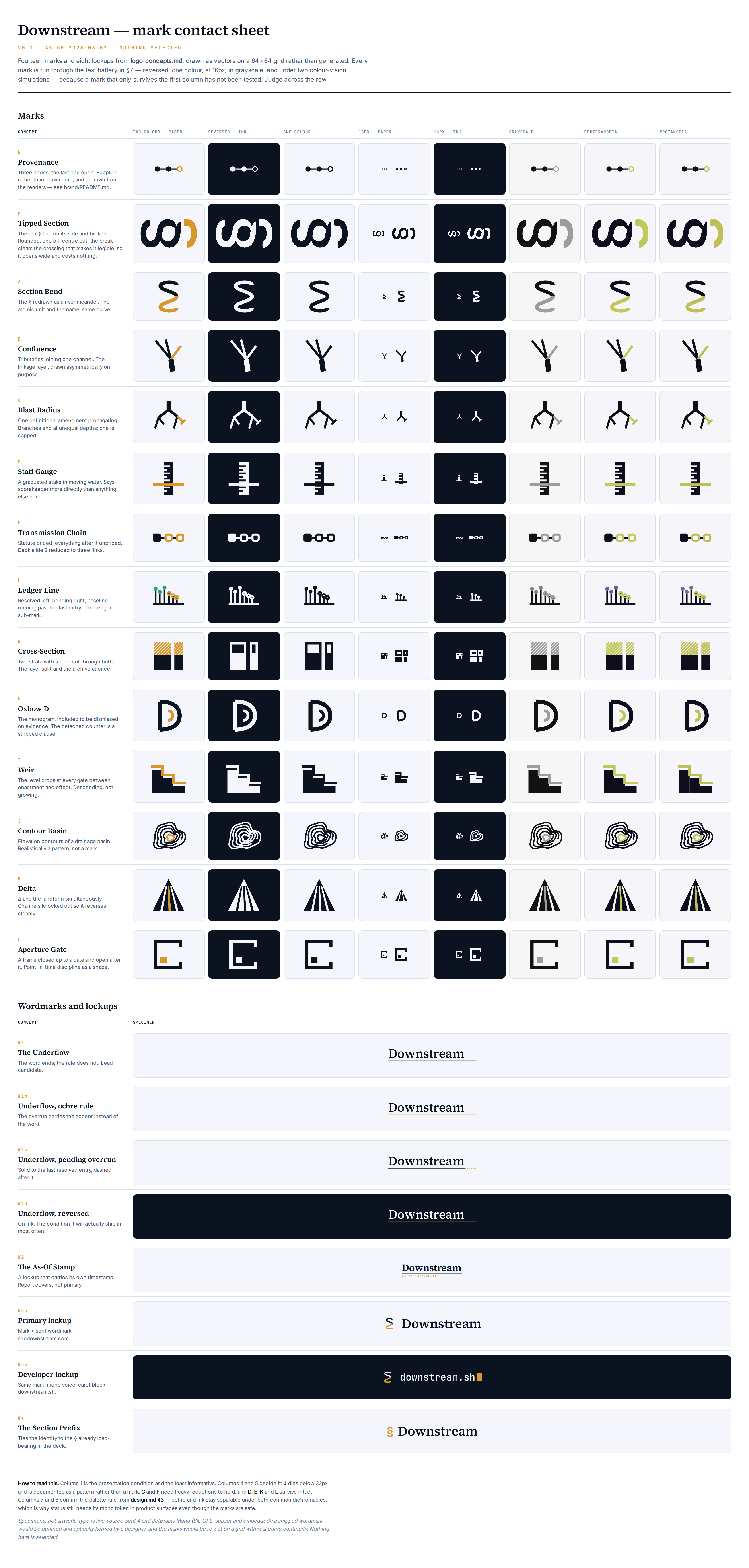
Every mark run through the test battery in logo-concepts.md §7 rather than shown at a flattering size.
How to read it
Columns, left to right: two-colour on paper, reversed on ink, one colour, 16px, 16px reversed, grayscale, deuteranopia, protanopia.
Column 1 is the presentation condition and the least informative. Columns 4 and 5 decide it. A mark that only survives the first column has not been tested.
What it showed
•J dies below 32px — reclassified as a pattern
•C and F need heavy reductions to hold
•D, E, K and L survive intact
•ochre and ink stay separable under both simulated dichromacies
That last one confirms the palette rule in design.md §3 but does not relax it: a mark has one meaning, a status chip has five, so product status still needs its mono token alongside the colour.
This sheet is what the review was reacting to. Most of these are now parked — the set has narrowed to contour, chain and section.
Characters
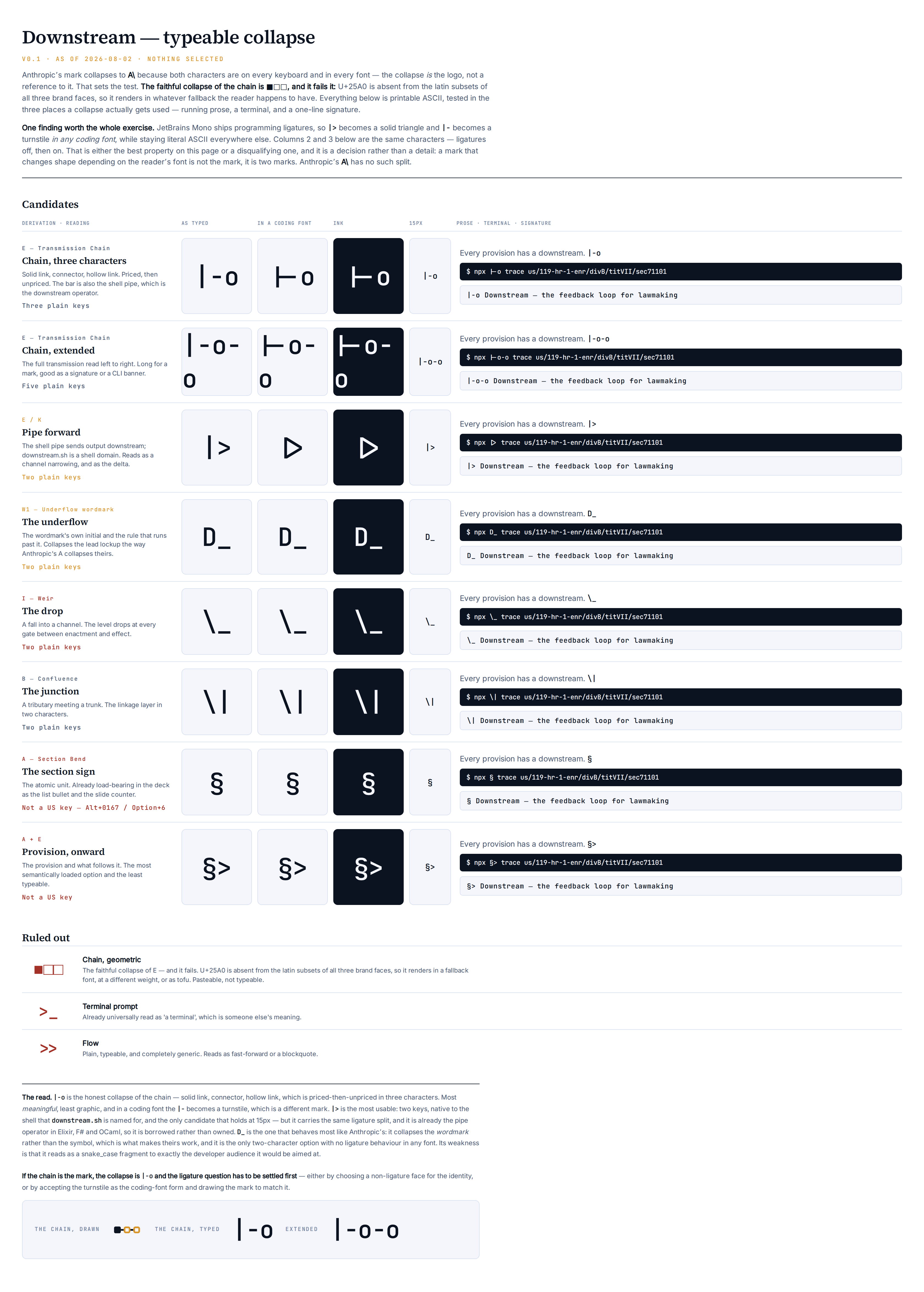
Can the mark collapse to characters the way Anthropic's collapses to A\?
The actual test
Not resemblance. Can someone type it on a standard keyboard, in someone else's font, and have it still be the mark?A and \ are in every font ever made — that is why theirs works.
Two findings
The faithful collapse of the chain is ■□□, and it fails. U+25A0 is absent from the latin subsets of all three brand faces, so it renders in whatever fallback the reader happens to have — different weight, different metrics, sometimes tofu. Pasteable, not typeable.
Coding fonts apply programming ligatures, and that splits the mark in two. In JetBrains Mono, |> becomes a solid triangle and |- becomes a turnstile; in prose, Slack or a browser they stay literal ASCII. Columns 2 and 3 are the same characters with ligatures off, then on.
That is either the best property on the page — plain text everywhere, a symbol in exactly the developer context downstream.sh is named for — or disqualifying, because a mark that changes shape depending on the reader's font is two marks. It has to be decided before a collapse is chosen, not after.
The shortlist
•|-o — the honest collapse of the chain. Priced, then unpriced, in three characters. Most meaningful, least graphic.
•|> — most usable. Two keys, native to the shell. But already the pipe operator in Elixir, F# and OCaml, so borrowed rather than owned.
•D_ — behaves most like Anthropic's, because it collapses the wordmark rather than the symbol. Only two-character option with no ligature behaviour.
§ is the most on-brand character available and the least typeable — not a US key. It renders everywhere and types almost nowhere.
Variants
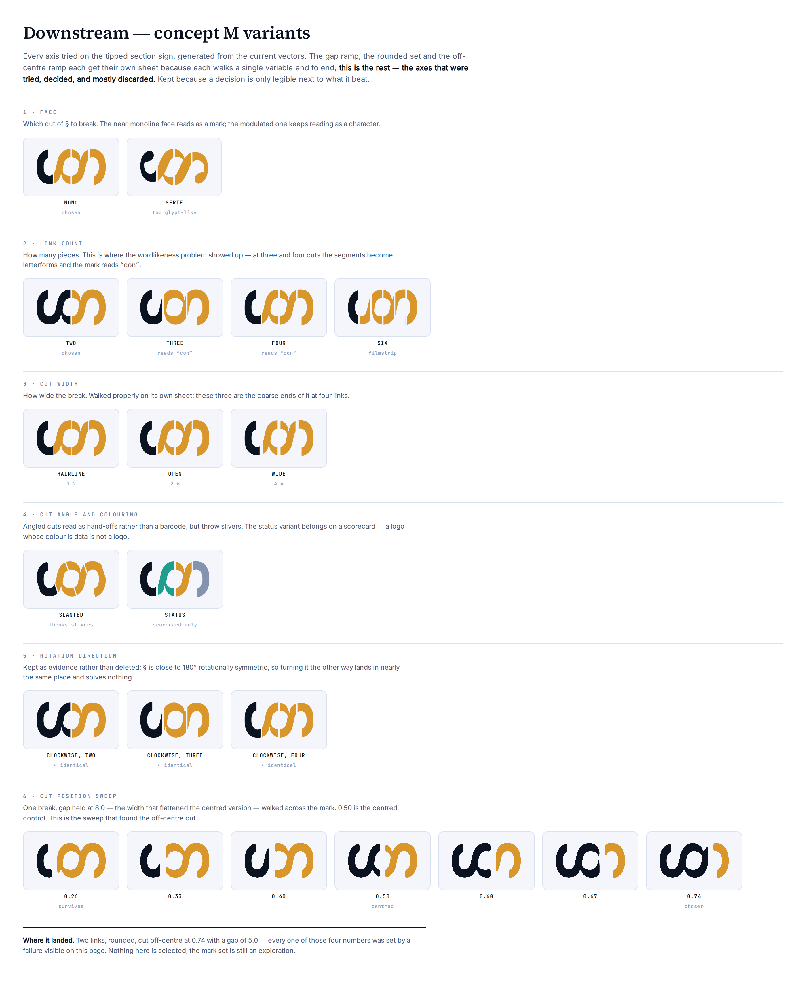
Every exploration axis for the tipped section sign on one page, generated from the current vectors rather than screenshotted once.
Why it exists
The gap ramp, the rounded set and the off-centre ramp each get their own sheet because each walks a single variable end to end. This is the rest — the axes that were tried, decided, and mostly discarded.
Kept because a decision is only legible next to what it beat.
What each axis settled
•face — the near-monoline cut reads as a mark; the modulated one keeps reading as a character
•link count — at three and four cuts the segments become letterforms and the mark reads "con", which is a bad word for a company whose pitch is accountability in government
•cut width — walked properly on its own sheet
•cut angle — angled cuts read as hand-offs rather than a barcode, but throw slivers
•status colouring — belongs on a scorecard; a logo whose colour is data is not a logo
•rotation direction — kept as evidence: § is close to 180° rotationally symmetric, so turning it the other way lands in nearly the same place and solves nothing
•position sweep — this is the one that found the off-centre cut
Where it landed
Two links, rounded, cut off-centre at 0.74, gap 5.0. Every one of those four numbers was set by a failure visible on this page.
The break
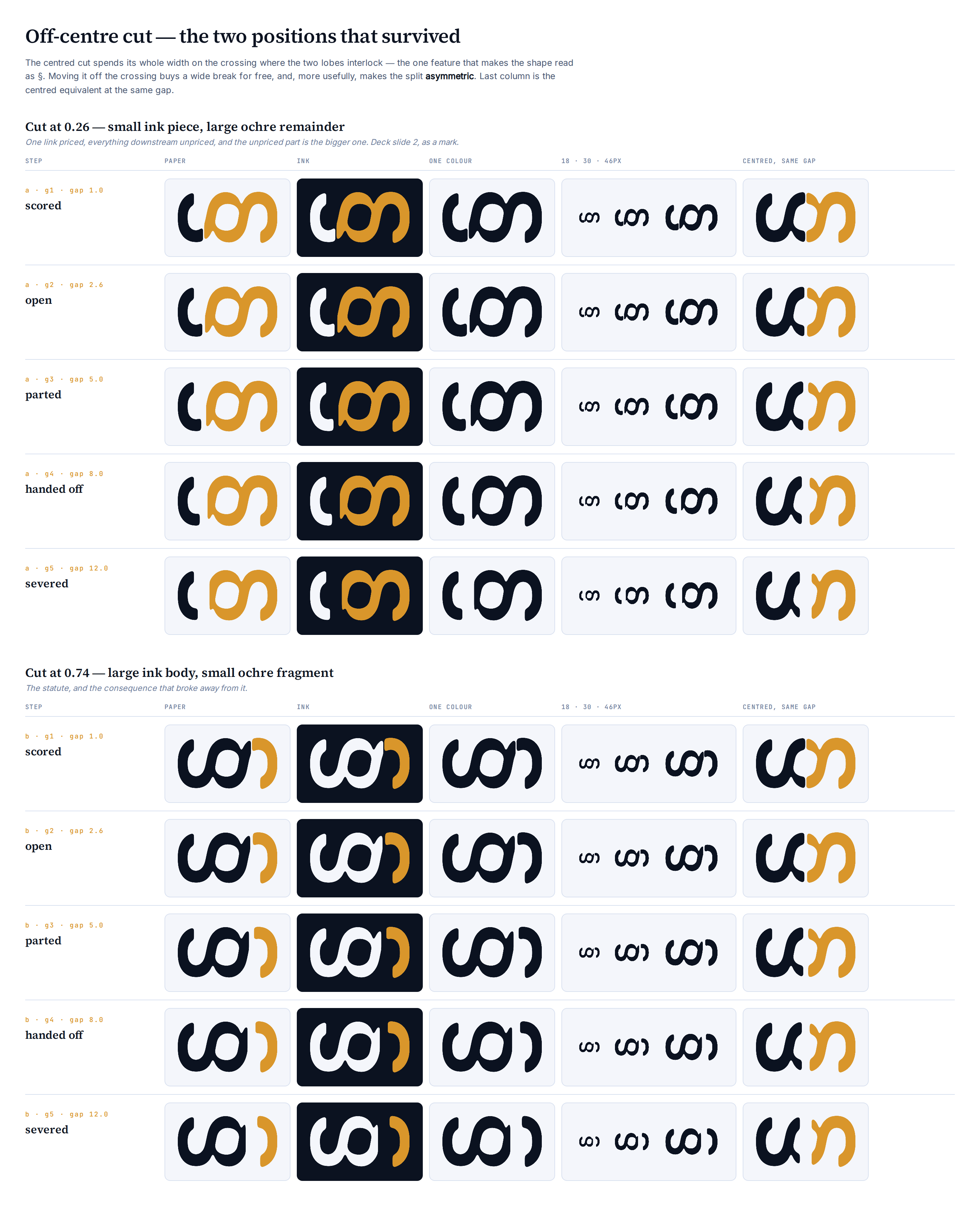
Sweep of cut position at a fixed wide gap, then the gap ramp at the two positions that survived.
The prediction, and how it was wrong
The hypothesis was that moving the cut off the crossing would let the gap open without destroying the glyph. Right about the mechanism, wrong about the payoff. The § does still read at gap 12 where the centred version had collapsed by gap 8 — but that is not the gain that matters.
The real one: an off-centre cut makes the split asymmetric, and asymmetry tells a story the even split could not.
position
reads as
0.26
small ink piece, large ochre remainder — one link priced, everything downstream unpriced, and the unpriced part is bigger
0.74
large ink body, small ochre fragment — the statute, and the consequence that broke away from it
The conflict worth deciding rather than splitting
0.26 has the better meaning but makes ochre the dominant mass — and design.md §3 is explicit that ochre is a marking colour, not a body colour. At large sizes it reads as an ochre logo with an ink accent, which is not this brand.
0.74 keeps ink dominant and ochre as the accent, at the cost of inverting the priced/unpriced story. That reading was always going to need a caption; the colour rule does not.
Rounded
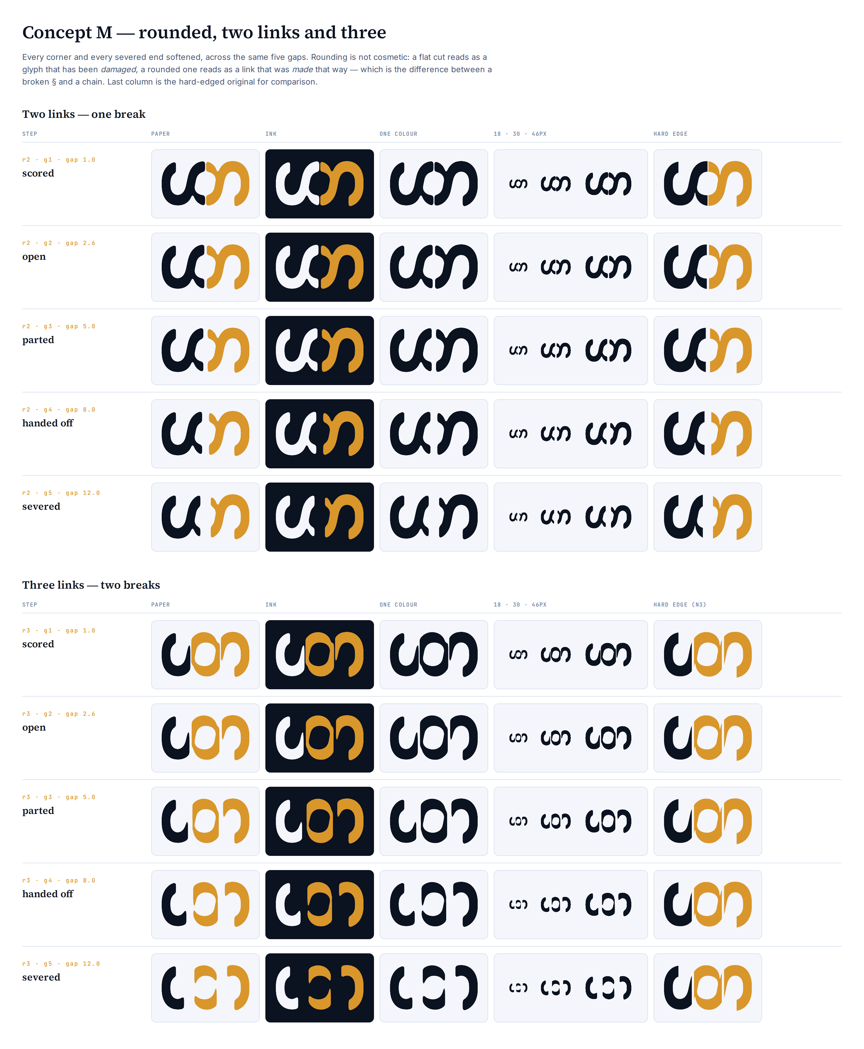
Every corner and every severed end softened, across the same five gaps, at two links and at three.
Rounding is not cosmetic
A flat cut reads as a glyph that has been damaged. A rounded one reads as a link that was made that way. That is the difference between a broken § and a chain, and it is the concept's whole argument — so it should probably have been the default from the start.
How, since it is not obvious
A clip always leaves a flat severed edge no matter what shape does the clipping, because the SVG painting order runs a filter before its own element's clip. The corners have to be rounded after the cut: an inner group carries the clip, an outer group carries a blur-and-threshold filter, and colour arrives via a masked rect so the blur never drags the fill toward transparent at the edges.
Consequence: these are filter-based. Resolution-independent, but not clean outlines. That debt is what the geometry-system rebuild finally paid off, by drawing the mark as a stroke instead.
Two links versus three
Two: a straight win. They read as interlocking links rather than a cut character.
Three: rounding makes it worse. Rounded forms look more like type, so the three-link set reads "con" more insistently than the hard-edged version did. That is the opposite of what softening was supposed to buy, and it is a reason to drop the route rather than a detail to tune.
The gap ramp
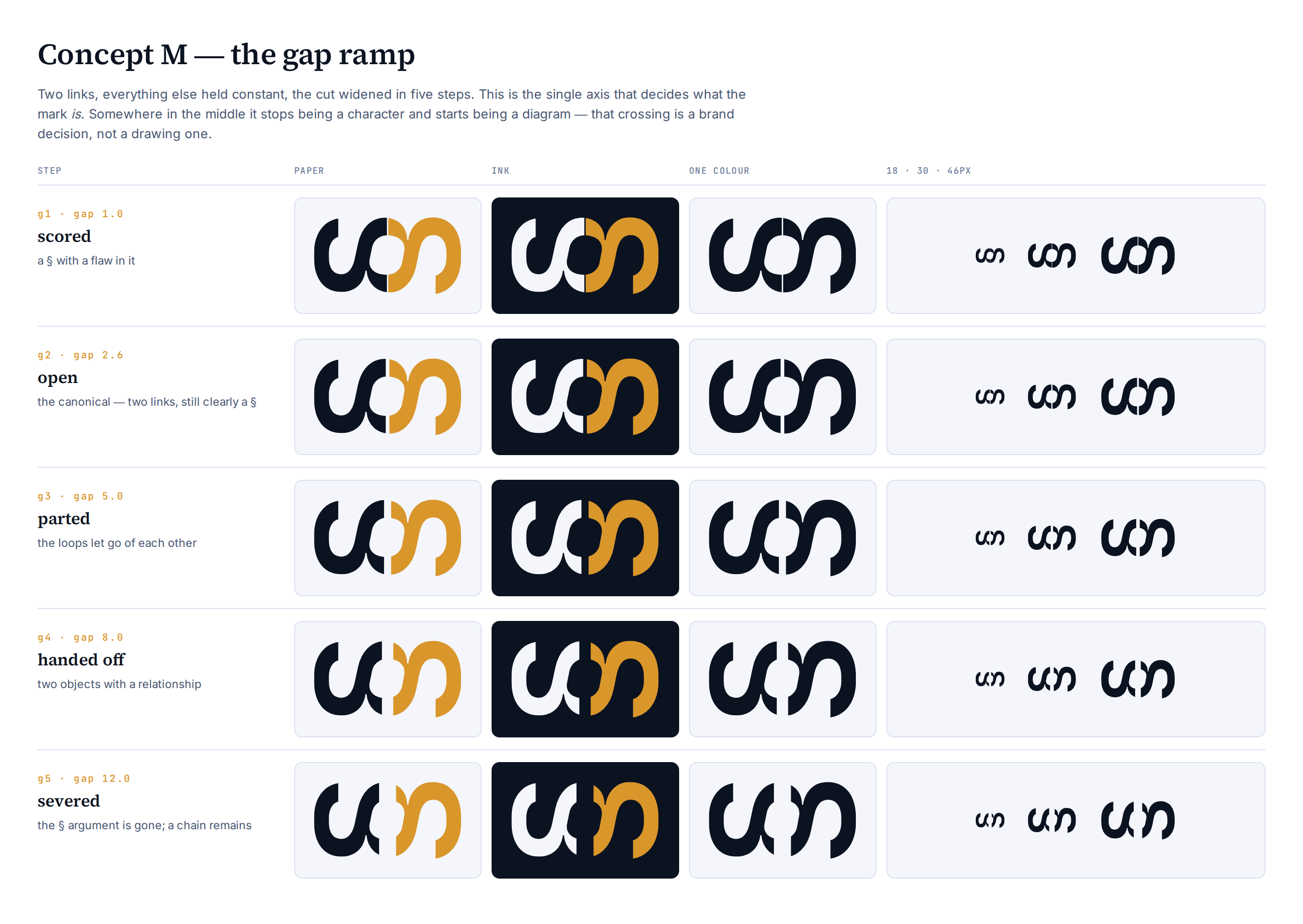
Two links, everything else held constant, the cut widened in five steps. The single axis that decides what the mark is.
step
gap
reads as
g1
1.0
a § with a flaw in it — at 18px the cut closes entirely
g2
2.6
two links, still unmistakably a §
g3
5.0
the pick — break unambiguous, glyph still whole
g4
8.0
two objects with a relationship
g5
12.0
the § argument is gone; a chain remains
The structural finding
The cut falls at the horizontal centre — which is exactly where the two lobes cross. So widening the gap does not just separate the links, it eats the interlock. And the interlock is the entire reason it reads as a section sign.
That is why g5 stops being a character. Not because the pieces are far apart, but because the crossing is gone.
Which is what pointed at the off-centre cut: open the gap somewhere that is not the crossing, and a wide break costs nothing. See The break.